A Step-by-Step Guide to Apparel Graphic Design and Sample Approval
Graphics are more than just decoration—they’re a core part of how fashion brands tell stories, express identity, and connect with customers. But behind every eye-catching graphic is a detailed process that, if overlooked, can lead to missteps in production.
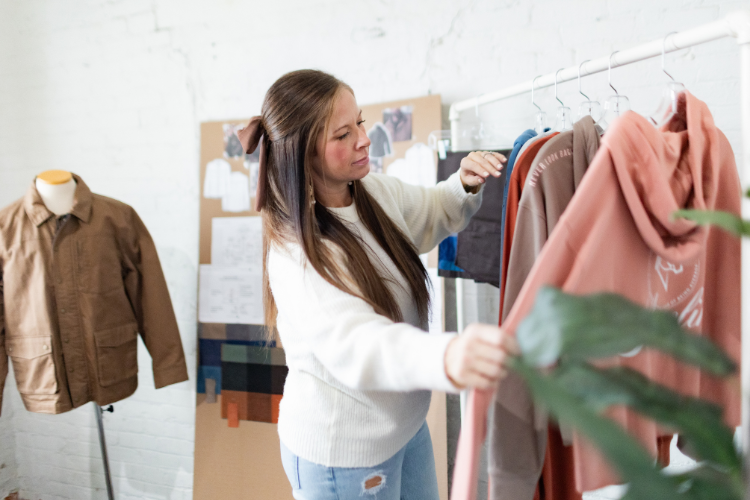
In this guide, Amanda Rango, a fashion designer with over 20 years of industry experience, breaks down the full lifecycle of apparel graphics, from concept development to sample approval, to help you navigate each stage with confidence and creative control.
To kick things off, let’s start at the beginning—with how to develop a strong graphic concept that’s rooted in inspiration and aligned with your brand’s identity.
The Impact of Graphics for Fashion Apparel Brands
In apparel, graphics do more than decorate —they communicate. Whether it's a bold logo or an abstract motif, the right graphic can tell a story, spark emotion, and strengthen your brand’s identity. For many fashion brands, graphics aren’t just design choices. They are trendsetters, conversation starters, and key drivers of cultural relevance.
Getting Started: The Graphic Concept
The graphic design process begins with inspiration. The inspiration is a spark that evolves into a concept and ultimately defines the look and feel of your apparel. This phase is rooted in research and intentional creativity, with your target customer always at the center of your decision-making.
1. Defining the Inspiration
Every great graphic starts with a compelling reference point. That could be market trends, your brand DNA, or even global influences. Begin by asking: What inspires you? What themes align with your brand story?
Inspiration can come from virtually anywhere:
A piece of artwork or photography
A vintage t-shirt or archival print
Graffiti on a city wall
Typography seen in signage or packaging
A scene from a movie
Global travel, nature, or cultural patterns
Competitive analysis and aspirational brands
The key is to curate your influences and interpret them through the lens of your brand’s aesthetic. As ideas begin to form, refine your visual research into a mood board that captures the direction for your graphics, including layout, styling, and color cues.

Take this mood board, for example. Each trend tear highlights a unique piece of inspiration that ultimately influenced the final product we created for our client, Maneline.
Inspiration shouldn’t be treated as a copy-and-paste formula. Instead, it’s a tool for gathering ideas, interpreting them through your brand lens, and transforming them into something original.
2. Considering Placement
As you explore concepts, you’ll likely start to visualize where graphics might live on a garment. Placement can dramatically affect the impact of a design — it can feel bold, subtle, modern, or classic depending on where and how it's positioned.
Common placement options include:
Center Front
Front Left Chest
Full Back
Sleeve or pant leg hits
Vertical layouts or offset positions

Keep in mind how the graphic will appear both on a hanger and on the body. A well-placed graphic should not only look intentional but also enhance the overall silhouette and movement of the garment.
3. Choosing the Format
Graphic formats are limitless, and each option sets a different tone. Your visual language might include:
Hand-drawn or original illustrations
Clean, modern typography or expressive fonts
Photo-realistic images or collages
Abstract shapes and textures
Logos, slogans, or iconography
The format you choose should support your concept and elevate the story you’re trying to tell. It should also align with your production capabilities — something we’ll dive deeper into in later sections of the guide.
4. Selecting the Silhouette
Start thinking about the silhouette and fabric that will showcase your graphic. Certain shapes work best with smaller, more subtle graphics, while others provide space for bold, oversized designs.
Once your silhouette and placement are defined, you’re ready to begin collaborating with a graphic designer.

Working with a Graphic Designer
Choosing the right graphic designer for your apparel project is just as important as the concept itself. Not all graphic designers are created equal, and understanding the distinctions between their specialties is key to finding the right fit for your brand.
1. Finding the Right Talent
Graphic designers come from a range of backgrounds, and their skill sets can vary widely. Some specialize in apparel graphics, while others are experts in branding, packaging, or digital design. Even within apparel, designers can differ in style, from clean, typography-driven layouts to whimsical, hand-drawn illustrations.
When sourcing talent, whether through freelancers, agencies, or in-house teams, consider the following:
Review their portfolio: Does their work align with your brand aesthetic and target customer?
Check their niche: Someone who excels in kids’ graphics may not be the best fit for a women's athletic line or a rugged menswear brand.
Understand their experience: Some designers specialize in production-ready files, while others may be more conceptual.
Also consider their familiarity with your specific needs — from logo design and icons to licensed graphics, packaging, or even web visuals. Before kicking off the project, be sure to define a clear Scope of Work, including the number of graphics, expected deliverables, timelines, and desired style direction. Clarity up front saves time (and revisions) later.
2. Tips for Clear Communication and Feedback
Creative collaboration thrives on clarity. When giving direction or feedback, it’s helpful to share:
Visual references (mood boards, sketches, or comps)
Notes on graphic style, tone, and color palette
Guidance on scale, placement, and layout
The garment type and fit for which the graphic is intended
The more specific your direction, the more efficiently your designer can bring your vision to life. Remember, design is subjective — aligning on expectations early helps avoid misinterpretation and keeps timelines on track.
3. File Types and Deliverables
Once the graphic is finalized, the format in which it’s delivered matters just as much as the design itself. File types should be chosen based on how and where the artwork will be used.
Here’s a quick breakdown:
AI / PSD: Editable source files (ideal for future tweaks and layered designs)
PDF: Print-ready files, often used for production hand-offs or internal reviews
PNG (with transparent background): Great for web, presentations, or quick previews
Before final delivery, ask yourself:
Is this for manufacturer production, internal review, or marketing use?
Do files need to be color-calibrated for print?
Will they be imported into another program or formatted into a line presentation?
By defining how the files will be used upfront, you’ll ensure you’re requesting the correct formats and save valuable time in the later stages of development.
Submitting Artwork to a Manufacturer
Once your graphic design is finalized, the next critical step is submitting production-ready artwork to your manufacturer. This isn’t just about sending a file — it’s about providing a complete, standardized package that sets the manufacturer up for success and ensures consistent execution across your product line.
1. What to Include in Your Artwork Submission
Start by developing a standardized template for all production artwork submissions. This helps maintain consistency across designers (whether in-house or freelance) and ensures your manufacturer receives everything they need in a clear, reliable format.
Your template should include:
Final artwork file (with proper file format and resolution)
Size and placement specifications
Pantone or color system callouts
Print technique and application notes
Fabric or surface information
Additional callouts like finish (matte, glossy), or special effects
When each submission follows the same structure, your production process becomes smoother, faster, and more scalable.
2. Size & Placement Specifications
Before submitting any final graphic, mock it up at actual size on the garment and assess placement in real life. Print out your artwork, tape it to a sample, and review how it looks when worn and when merchandised. This is the best way to evaluate:
Scale and proportion on different garment sizes
Placement accuracy (Center Front, chest, back, sleeve, etc.)
Balance with other design elements
Incorrect sizing or poor placement can lead to reworks, costly delays, and added fees for screen re-burning or reprinting. Always confirm and finalize these specs before sharing files with your manufacturer.
3. Color Callouts (Pantone, CMYK, etc.)
Precise color communication is essential in apparel graphics. Depending on your print method and factory preferences, you’ll need to specify the correct system:
Pantone Solid Coated (PMS C): Most common for apparel printing (especially screen printing)
Pantone TCX: Cotton-based standards are often used for fashion textiles
Pantone TPG: Paper-based standards
CMYK (Cyan, Magenta, Yellow, Black): Used for digital and sublimation prints
You’ll also need to consider the number of colors in your design — traditional screen printing has limitations (typically 6–12 colors, depending on the machinery). Confirm your manufacturer's capabilities before locking in a complex or multicolored graphic.
A beautiful design that can’t be produced within your factory’s constraints can become a costly disappointment. Always confirm what's feasible before presenting ideas to internal teams or buyers.
4. Printing Techniques (Screen Print, DTG, Embroidery, etc.)
The application method you choose will directly impact cost, quality, lead time, and design limitations. Here's a quick guide to common techniques:
Plastisol Screen Print: A vibrant, opaque ink that sits on top of the fabric. Great for bold, high-contrast designs.
Water-Based Screen Print: Softer, more breathable finish that absorbs into the fabric. Ideal for vintage or washed looks.
Sublimation: Heat-transfer method that dyes the fabric. Works best on polyester and white/light-colored garments.
Heat Transfer (Screen on Film): Ink printed on a transfer sheet, then heat-pressed onto the garment. Useful for complex designs and lower runs.
Flocking: Raised, velvety texture. Adds tactile interest but requires careful handling.
Foil: Reflective, shiny application. Attention-grabbing but may crack over time if not applied correctly.
Puff Ink: Expands under heat to create a 3D effect. Works well for logos or accents.
Embroidery: Thread-based design stitched directly onto the garment. Offers a premium, tactile feel.
Appliqué: Fabric pieces sewn onto the garment. Great for bold, dimensional graphics.

5. Application Surface (Fabric Considerations)
Not all fabrics are created equal, and not all techniques work on every surface. Always evaluate your desired graphic treatment against the base fabric quality. Here are a few examples:
Jersey or Cotton Tees: Compatible with most print techniques (screen, DTG, heat transfer, embroidery).
Fleece: Works well for exterior prints, but interior labels may not adhere cleanly due to the brushed surface.
Stretch Knits or Ribbed Fabric: May distort graphic alignment over time or with wear — use flexible inks or embroidery where possible.
Canvas or Twill: Heavier-weight materials handle embroidery, appliqué, and puff inks well.
Choosing the wrong technique for a fabric can lead to cracking, peeling, poor adhesion, or distorted visuals. Always test where possible.
6. Minimize Revisions Through Clarity
The more precise and complete your submission, the less room there is for misinterpretation — and the fewer revisions you'll face. Every rework costs time, money, and resources.
To avoid costly setbacks:
Know your fabric type
Choose the appropriate technique
Align on color systems and file formats
Confirm manufacturer capabilities
A successful graphic doesn’t stop at a strong design — it’s about ensuring that the design is production-ready, technically sound, and fully aligned with your manufacturer’s processes. When your artwork files are clear, consistent, and complete, you reduce friction in the production chain, improve speed to market, and ensure your final product looks exactly as intended.
Reviewing Graphic Design Strike-Offs
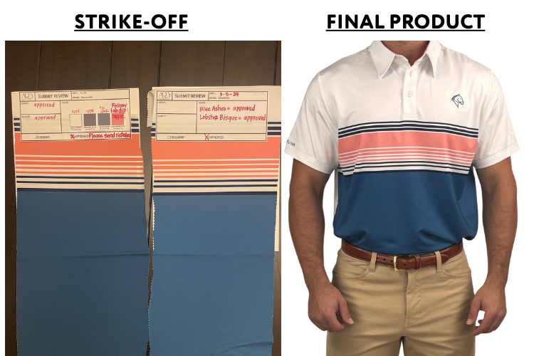
Once your artwork has been submitted to the manufacturer, the next crucial step is reviewing the strike-off — a small but mighty part of the production process that ensures your graphic comes to life exactly as intended.
What Is a Strike-Off?
A strike-off (or hand loom, for wovens) is a pre-production sample of your graphic, print, or pattern — applied to the correct fabric, using the final print technique, and executed in your requested colors.
Rather than applying artwork directly to a garment sample from the start (which is more costly and time-consuming), a strike-off allows you to evaluate and refine the execution early in the process. If adjustments are needed, strike-offs can be reworked quickly and resubmitted until approved. Once finalized, they serve as a visual and tactile reference for placement on the garment and for bulk production.
What to Look for in a Strike-Off — and How to Give Feedback
Strike-offs are all about refinement. Here’s what to check—and how to provide vendors with clear, actionable feedback:
✔ Color Accuracy
Compare each color to your original Pantone, TCX, or CMYK references. If you're using screen printing, colors can be individually adjusted. For techniques like sublimation or DTG (which are processed as full-color prints), provide overall comments on vibrancy or balance rather than isolating individual tones.
How to give feedback:
“Red needs to match PMS 186 C — current version is reading too orange.”
“Overall print feels dull — please increase saturation across the entire graphic.”
✔ Print Clarity
Review the sharpness, definition, and detail. Look closely at fine lines, textures, or image resolution. If the graphic feels blurred, too soft, or inconsistent with your digital file, it may need reworking.
How to give feedback:
“Edges of text are slightly fuzzy — please sharpen linework.”
“Background texture is printing too dark — adjust opacity to match artwork reference.”
✔ Placement & Scale
Confirm that the scale of the strike-off matches your approved specs, and that orientation/layout aligns with your artwork. If anything looks off, call it out clearly.
How to give feedback:
“Graphic is positioned 1” too low — should sit 2.5” below the neckline.”
“Please re-align the left edge of the artwork to center it on the chest.”
✔ Hand Feel & Texture
Evaluate how the print feels to the touch and interacts with the fabric. Consider softness, flexibility, and durability. If it feels too stiff, too transparent, or poorly bonded, note it. Some issues can be resolved with a different ink weight, an additional layer, or an adjusted heat setting.
How to give feedback:
“Print feels too rigid — please explore softer ink or water-based option.”
“Black fill looks patchy due to fabric bleed-through — consider thicker base layer.”
“Ink cracking slightly when stretched — can you test on alternate ink formulation?”

Keeping strike-off reviews organized and clear helps reduce revisions and gets you closer to an approved sample faster. Use visuals, annotations, and concise written comments to communicate with your vendors, and always keep a record of feedback and approvals for consistency through production.
Final PP Sample Approvals
After perfecting your graphics through strike-offs and revisions, the final step is seeing everything come together in the Pre-Production (PP) Sample. This sample should reflect exactly what will go into bulk production — from fabric and fit to color, graphic placement, print quality, trims, labels, and hangtags.
At this stage, your job is to review every detail with a critical eye. Does the graphic match your approved strike-off? Is the scale, placement, and application technique correct? Are all garment components — including packaging — aligned with your brand standards?
The PP sample is your final checkpoint before greenlighting production. Taking the time to carefully inspect it ensures consistency, quality, and confidence in what will ultimately reach your customers.
Common Mistakes to Avoid in Apparel Graphic Design
Even experienced teams can run into hiccups when it comes to apparel graphics. Avoiding these common mistakes can save time, money, and frustration down the line:
Lack of Clear Creative Direction
Jumping into design without a solid concept or mood board often leads to inconsistent results. Always start with a defined point of inspiration and customer lens.Forgetting the End Use
Designing without considering fabric type, garment fit, or print technique can result in poor-quality graphics or technical failures in production.Unrealistic Color Expectations
Not all colors translate equally across different print methods or fabrics. Be sure your color callouts are appropriate for the technique and material used.Neglecting Scale and Placement
A graphic that looks great on screen may look awkward on a real garment. Always print mockups and test scales on actual samples or paper layouts.Using the Wrong File Types
Sending low-resolution or incorrect file formats to manufacturers can delay production and compromise graphic quality. Know the specs upfront.Poor Communication with Designers or Vendors
Vague feedback and missing visual references lead to misinterpretation. Always be specific, visual, and aligned with your production goals.
Apparel graphic design is both an art and a science — a balance of creative storytelling and technical execution. From concept development and designer collaboration to vendor communication and production strike-offs, every step plays a role in the final outcome.
By staying intentional, organized, and collaborative throughout the process, your designs not only look great on paper — they come to life beautifully in production.
Ready to elevate your graphics from idea to shelf? ARD Fashion Consulting is here to guide you through every stitch and screen.
Your Partner in Graphic Development: ARD Fashion Consulting
Apparel graphics are a powerful bridge between creativity and commerce. When done right, they translate your brand vision into wearable art that resonates with your customer. But getting from concept to finished product takes more than inspiration; it takes intention, strategy, and production know-how.
If you're looking for support turning graphic ideas into ready-to-produce assets — or simply want to strengthen your process — ARD Fashion Consulting is here to help. Whether you need creative direction, designer matchmaking, or hands-on development guidance, we’re ready to partner with you.
Let’s bring your next graphic to life. Contact us to get started.